The Problem :
A profession once living in splendid, white-slippered isolation is now fiercely competitive.
In this changing market, White & Case — a huge, well-respected legacy firm — was in danger of being left behind.
The Brief :
A competitive market full of worthy alternatives places a premium on distinctive branding. We needed to build a brand system and platform that could poke beige in the eye, help the firm rise above the field and nudge stakeholders in its direction.
The Creative Solution :
The category around the brand felt like an airport lounge.
Its playbook was full of predictably rational messaging, driven by logic and competence. High-performing, without a doubt — but also rather hollow and hard to navigate.
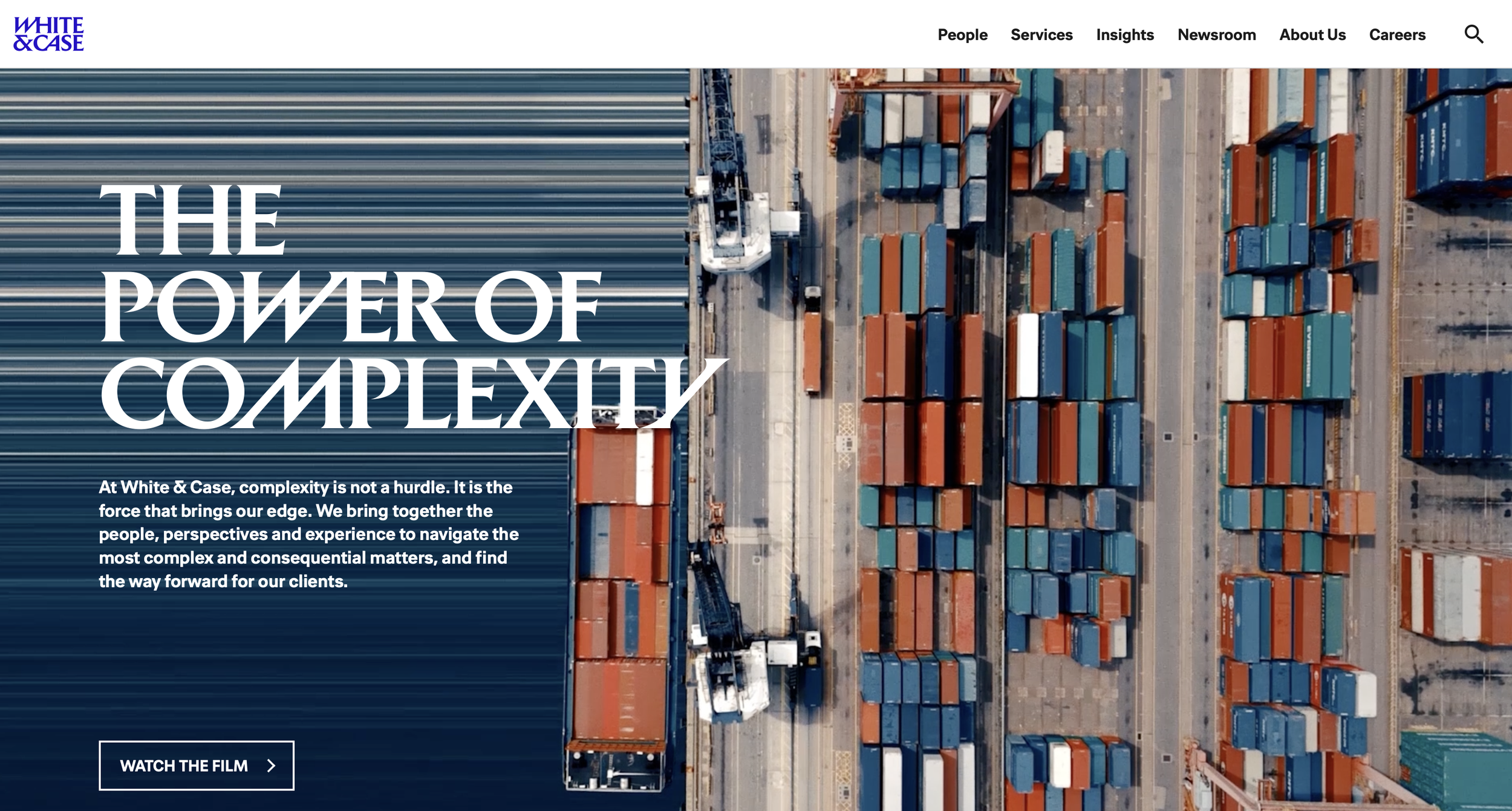
In tandem with our brand and media partners, we equipped White & Case with a point of view on the world beyond its product: the power of complexity. White & Case wants the complexity we’re being conditioned out of. The firm finds strength in stressors and feeds on friction — because where there is friction, there is heat, energy and the potential for powerful transformation.
This potent idea laid the foundations for our visual world and system of behaviors. In a world of beige corporate signals, ours would embrace movement, energy, electric shades and assertive typography.
Establishing the values and beliefs of a firm forged in the hottest, blue part of the flame.