The Problem
Summer is peak beer season in the US and it is mentally, culturally, emotionally owned by lager. Guinness' body language - dark, pub-locked and Irish - made it the harder choice in the warmer months. No amount of messaging would change that.
The Brief
Behavioral science has a neat principle that suggests it is far easier to change behavior by making the desired action feel intuitively familiar than by asking people to adopt something new.
So rather than telling people Guinness belongs in summer, the brief became to make it feel like it already, naturally, did.
We needed to make the iconic pint behave differently - casting familiar Guinness cues in an unfamiliar light.
The Creative Solution
Magic often hides in the things we overlook.
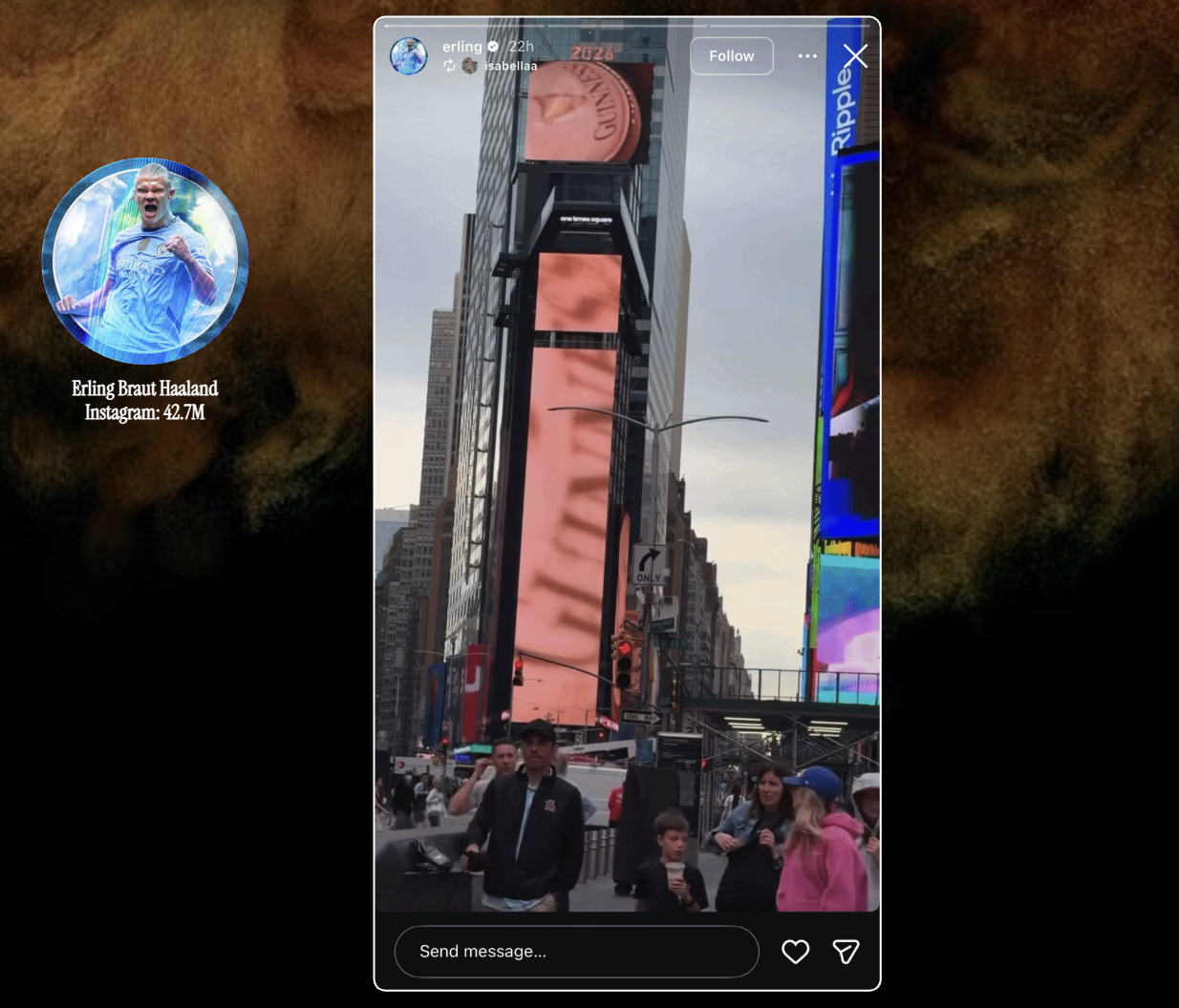
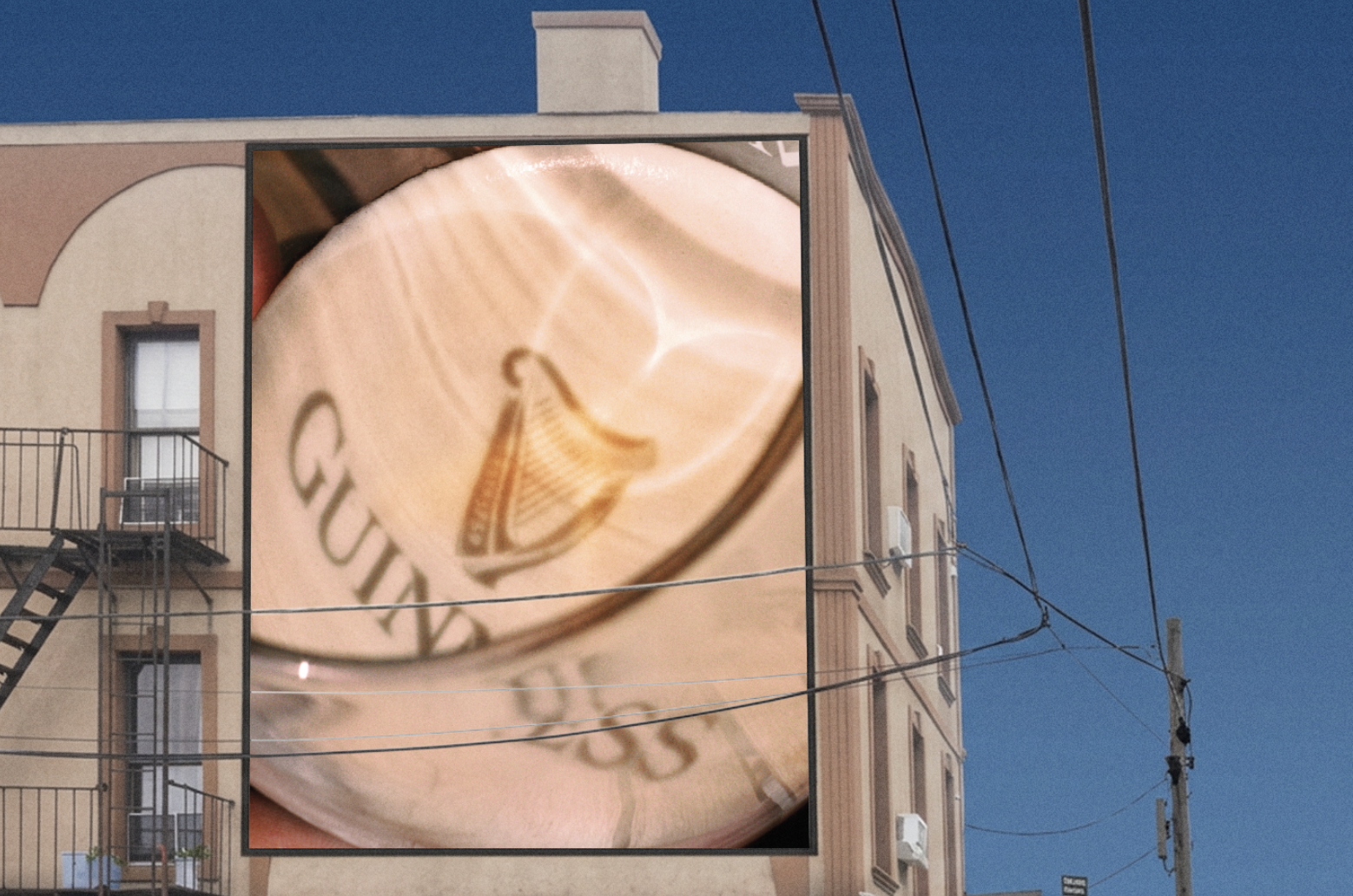
On an unusually warm evening, one of the studio’s creatives noticed the setting sun projecting the Guinness Harp onto the golden head of a half-finished pint. It was a fleeting, beautiful moment that made a familiar pint suddenly feel inseparable from summer.
Rather than inventing new seasonal assets, we therefore let Guinness' own distinctive brand assets do the work: using the season’s light to reframe the pint as an obvious summer choice.
The idea also benefited from another well-established behavioral principle : the more visual, visceral and concrete an idea is, the more likely we are to notice it, remember it and act on it.
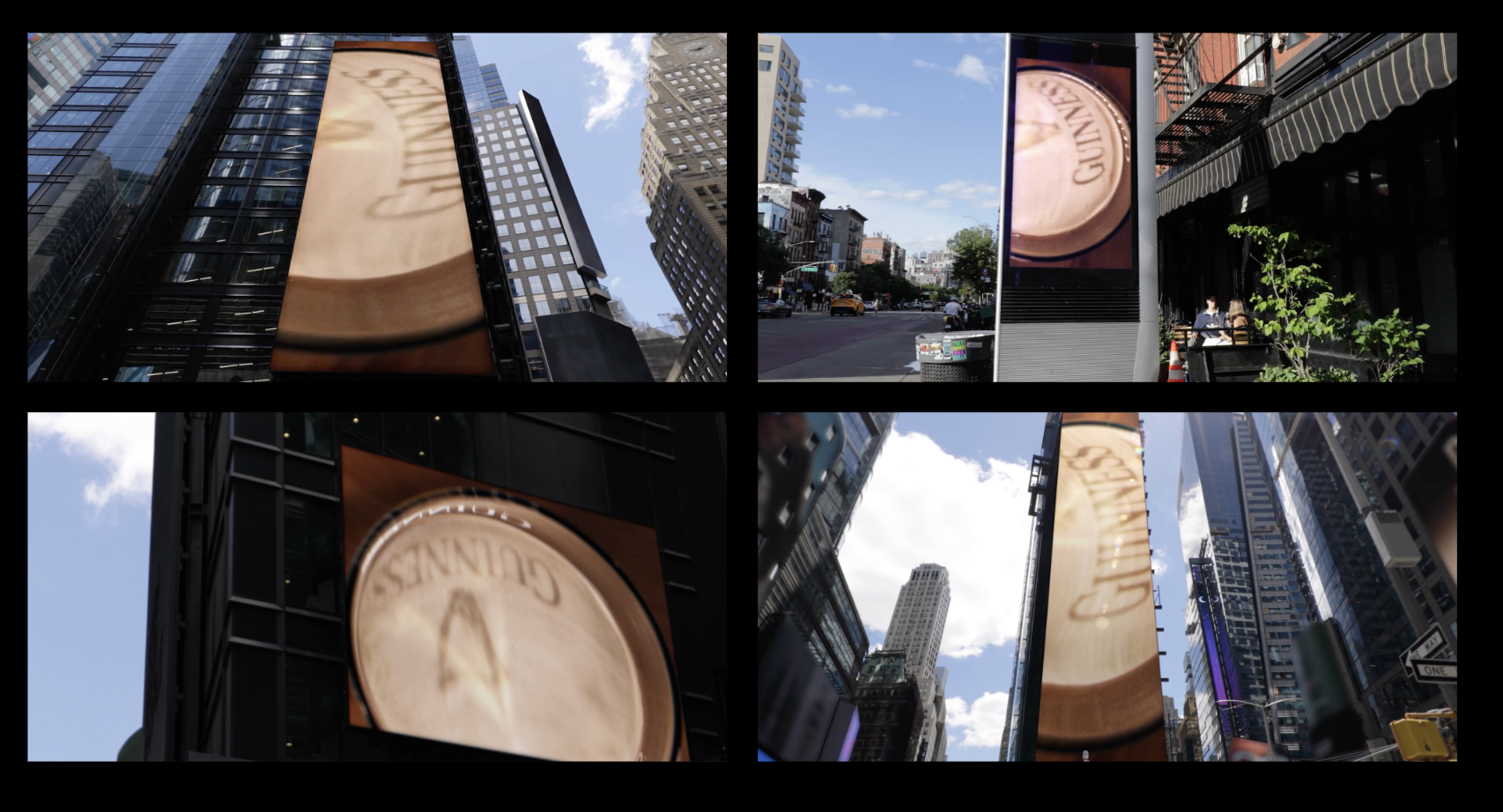
We designed a series of minimalist OOH executions built around this singular visual, selecting placements where the sun could recreate the Harp and logo’s shadow throughout the day.
Supported by digital outdoor, the executions played with the format and people’s expectations, letting people connect the cognitive dots for themselves : reminding them that perhaps there had always been something wonderfully sunny and summery about a pint of Guinness.